Role: Ux research, UI design
Scope: Mobile Application
Time Line: 3 months
This app is an accompaniment to the in-person experience a gallery provides. Users are able to make offers on works on display in the gallery, support local artists, and track their artworks as they’re shipped.
This project was created to leverage my visual design skills and apply my knowledge of UX research and writing. I applied design thinking to focus my solutions on the user, ask questions, and iterate to create a unique solution for the user’s needs.
I came into the project thinking auctions were exciting. I began conducting scripted interviews to collect qualitative data from users who have participated in online auctions. I wanted to understand what motivated them to participate in an online auction, describe the experience, and brainstorm any ideas to enhance that experience. Almost all of my interviewee’s expressed similar themes of anxiety, frustration, and a lack of transparency.
Many users said they would rather look for a “buy it now” option, or contact the seller directly with an offer. Online auctions were their least prefered method of making a purchase, but users were comfortable naming the price they’re willing to pay.
This insight would become the foundation of my design. Instead of making online auctions palatable for users, I decided to design around the user placing the offer they’re willing to pay, and handle all the “auctioning” behind the curtain.
Some tips for navigating the Prototype
Only the first painting “At Odds 4: an Arch” is set up to go through the checkout process.
For the best experience, please view on desktop.
All of the artworks and content were taken from a NYC gallery, “the Hole”, located in the Lower East Side.
I synthesized the information from my interviews to create two user profiles: the experienced user and the inexperienced user. I created empathy maps to understand their goals and frustrations.

“Auctions are frustrating and overwhelming”
•To acquire a piece of art within their budget
•To support the local art scene
•Unable to keep up with the speed of an online auction
•Hesitant to bid higher and escalate the price too quickly
“I hate being caught in bidding wars”
“I’m motivated by the low price of the auction”
“The ideal auction is where I have all of the information regarding the auction”
•Auctions are an opportunity to find rare things for a low price”
•The auction process is unclear and the rules are not specified
•Starts bidding low
•Leaves the auction when the price is above budget
•Sets notifications
•Disappointed
•Cheated
•If he had more information, he would’ve had a better chance

“Auctions aren't really fair”
•To acquire a piece of art for the lowest price
•To win
•Bots that place the highest bid in the last seconds
•The finite timer guarantees the last bid wins.
“I go to auctions for favorable pricing”
“Bots are an issue”
“In real auctions the timer extends until there are no more bidders”
•Bots are a problematic tool
•Online auctions don't reflect the in person experience
•Use a bot if available
•Sets notifications
•Keeps bidding low
•Anxiety and excitement
•The online marketplace isn't fair
•The rules encourage the use of bots
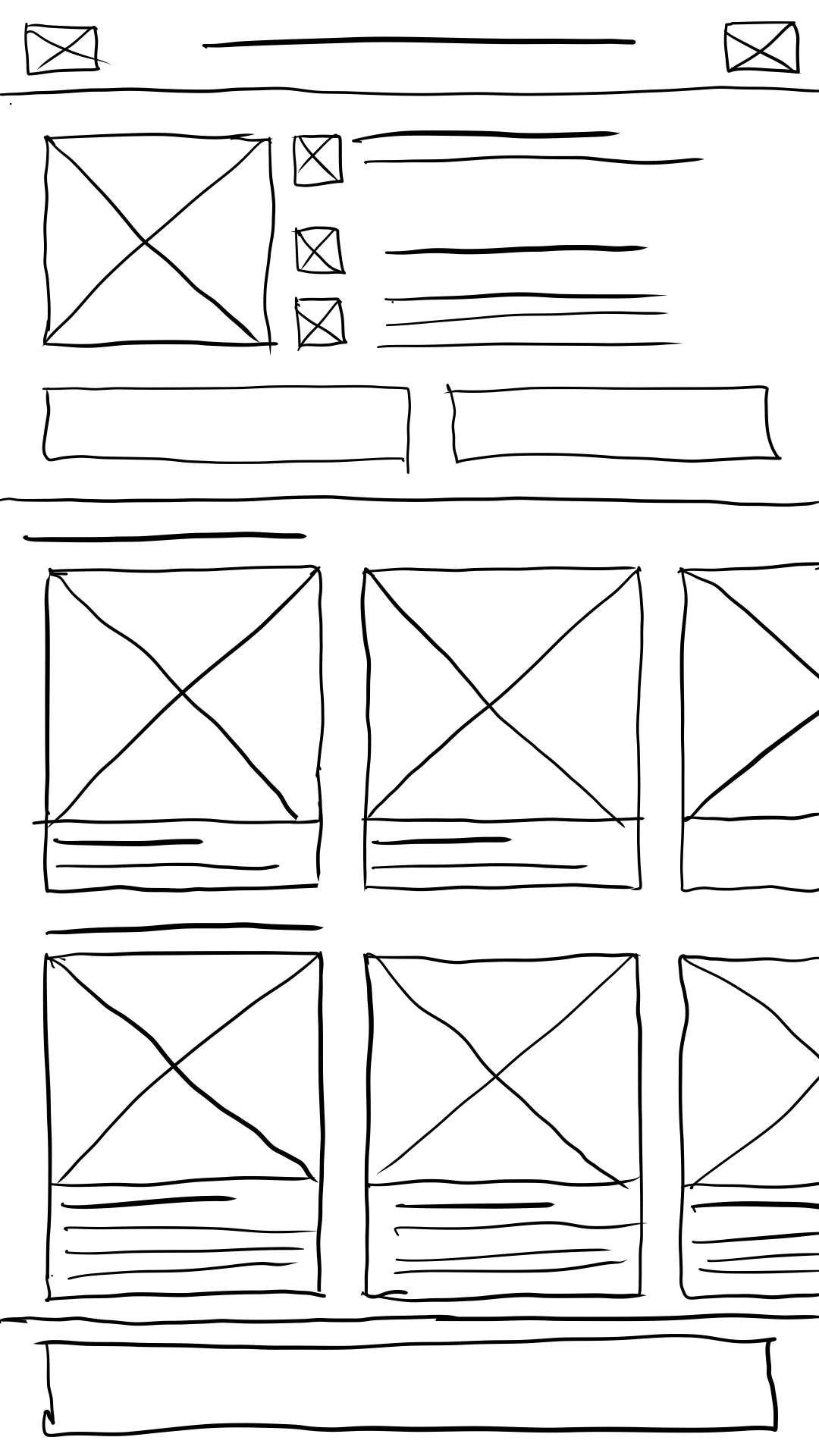
I prefer to start designs on paper, where I can explore concepts in a messy way. At this point I thought it best to have the homepage open with the exhibition details and a feed of the artworks on display. I had already started experimenting with different forms of architecture, and decided on a linear flow.
Using my sketches as a reference, I bega refining my designs into wireframes, and eventually a low fidelity prototype. My sketches gave me a basic framework to build on.
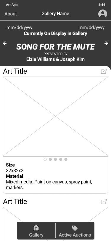
This is my first iteration of the prototype, which I used to conduct my usability test. I wanted to test the user flow, and gauge user’s content expectations.
Some tips for navigating the Prototype
Only the first card is set up to go through the checkout process.
For the best experience, please view on desktop.
Using Figma’s prototyping tools, I turned my digital wireframes into a working prototype so I could test my approach with real users. I conducted moderated usability tests, where users were given tasks to complete within the prototype and asked to verbalize their thoughts as they worked through each task. After the usability test, users were asked to return a 10 question survey on whether they agreed or disagreed with statements about the app. Once I had enough data, I synthesized the results into themes which became insights.
It was observed that 3 out of 5 participants will not click the help button, before placing their offer. This means that most users will not click the help button to see the help menu.
It was observed that 3 out of 5 participants found the header information unclear. This means that most users need clearer wording and hierarchy.
It was observed that 3 out of 5 participants wanted more information, which was hidden behind cards. This means that most users need to be alerted that the cards are clickable, and they can learn more.
It was observed that 5 out of 5 participants found an answer they wanted in the help menu. This means that all users find the help menu valuable.
Based on the theme that: some users had trouble navigating to active offers screen an insight is: the navigation needs at least 2 visual cues to be literate.
Based on the theme that: most users need to be alerted that the cards are clickable and they can learn more, an insight is: The art card needs to prompt users to “learn more by tapping the card.”
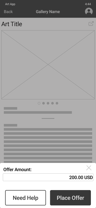
Based on the theme that: most users will not click the help button an insight is: the help menu should be brought forward to make the information more accessible, rather than be hidden behind a button.
Based on the theme that: Most users need clearer wording and hierarchy in the header an insight is: wording and hierarchy needs to clarify the exhibition title, contributing artists and display period in the header.
Armed with these new insights, I could begin working on my high fidelity prototype. At this stage I thought it would be a good decision to begin building a sticker sheet with high fidelity assets and typography to define and organize my design decisions. I began utilizing design resources from Apple, including SF Symbols, typography guidelines, and their Human Interface Guidelines.
I decided to go back to my research to find more solutions. With all these factors, I decided to test new solutions, which resulted in a new direction for my project.
Some tips for navigating the Prototype
Only the first painting “At Odds 4: an Arch” is set up to go through the checkout process.
For the best experience, please view on desktop.
All of the artworks and content were taken from a NYC gallery, “the Hole”, located in the Lower East Side.
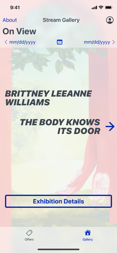
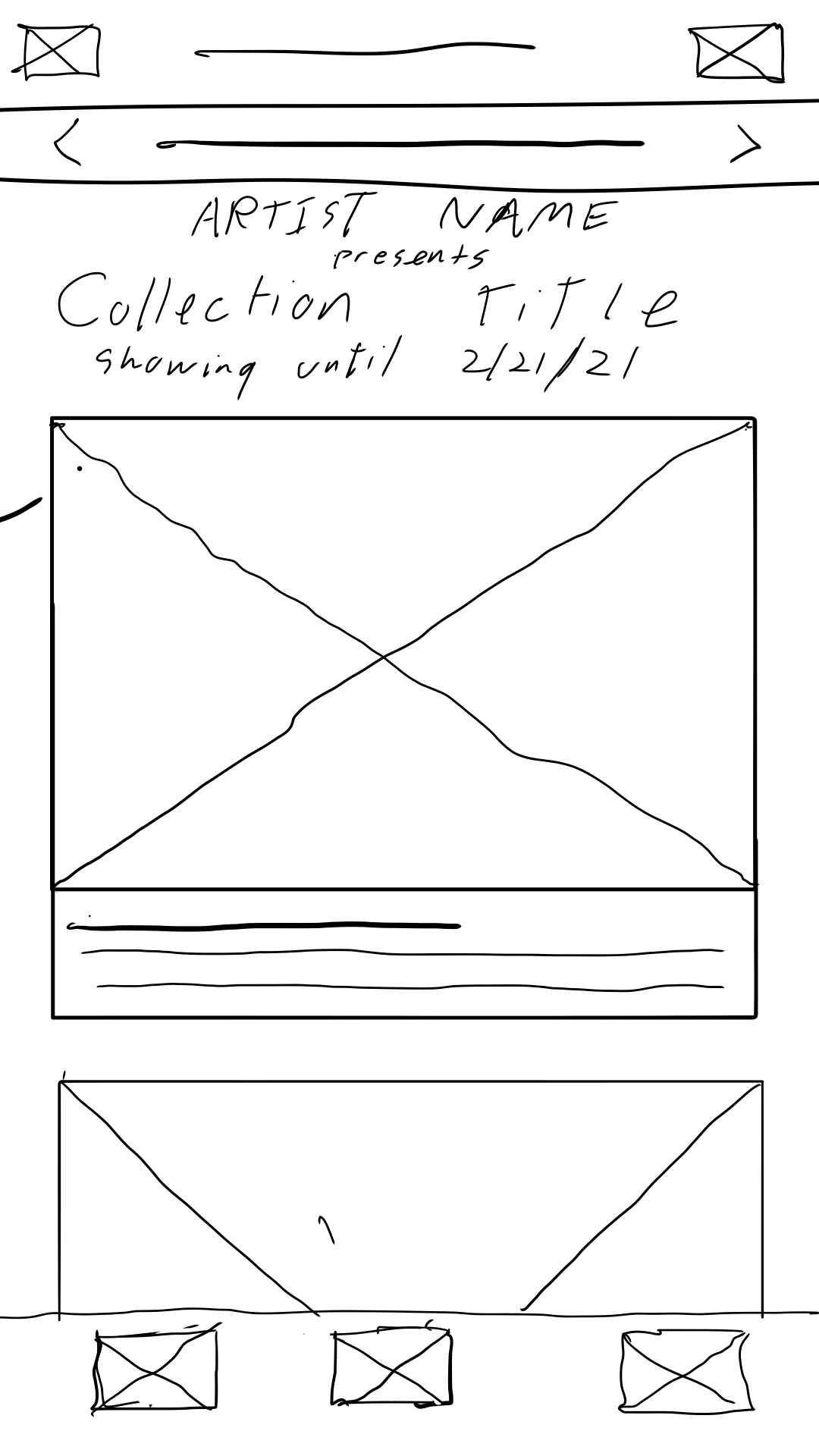
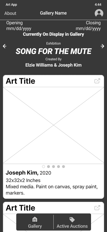
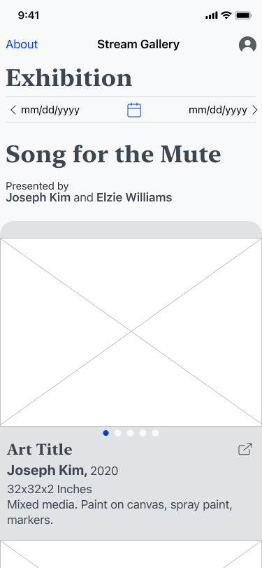
I simplified the homepage to show just the dates, title, and artist. My original design was too cluttered trying to have this information and a feed all on the same page. This layout is significantly clearer to users. I used a background image from the exhibition to aid in visual recollection in case users are scrolling through past shows looking for an artist they particularly liked. I was worried users wouldn’t know how to navigate from this screen, but the arrow proved to be sufficient. This screen acts as a doorway into the exhibition.
I simplified the homepage to show just the dates, title, and artist. My original design was too cluttered trying to have this information and a feed all on the same page. This layout is significantly clearer to users. I used a background image from the exhibition to aid in visual recollection in case users are scrolling through past shows looking for an artist they particularly liked. I was worried users wouldn’t know how to navigate from this screen, but the arrow proved to be sufficient. This screen acts as a doorway into the exhibition.
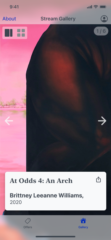
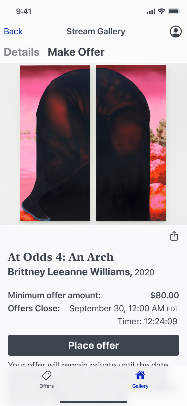
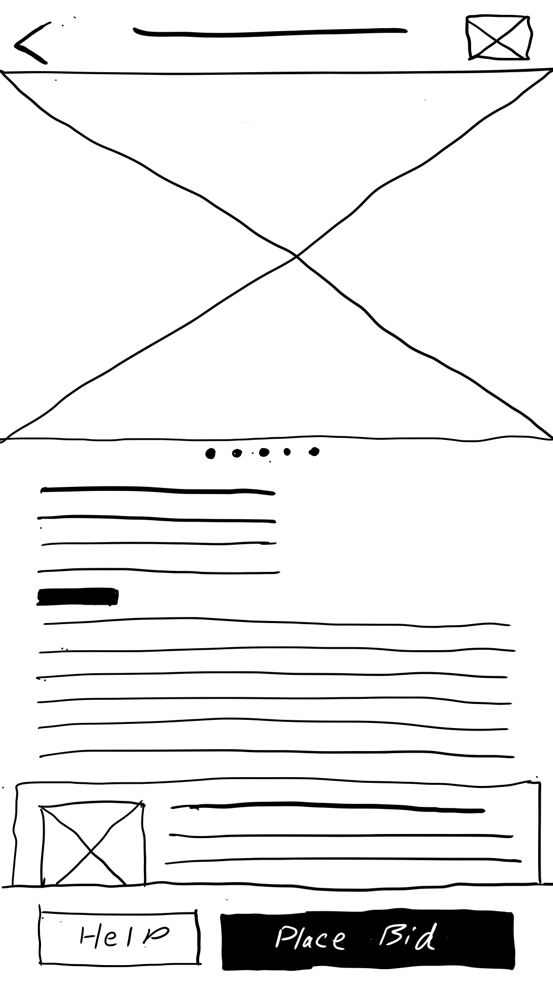
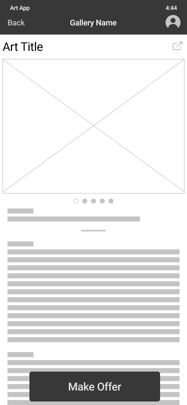
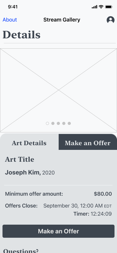
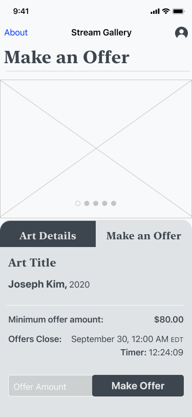
In order to maintain user focus and scalability, I separated the details page and the offers page into two separate tabs. Galleries can show many different types of shows, so the details page has room for artist statements, critique analysis, historical context, and any other content the user might need to understand what they’re viewing. The “Make offer” screen delivers all the information a User needs to place an offer. Under the fold is a link to the F.A.Q and a contact button to email the gallery directly for help.
One of the most important insights I gained from my usability test was most Users were not going to see the F.A.Q, so from this point onwards I tried to include helpful information directly on each screen as they became relevant. This proved to be a successful solution as seen in my second usability test.
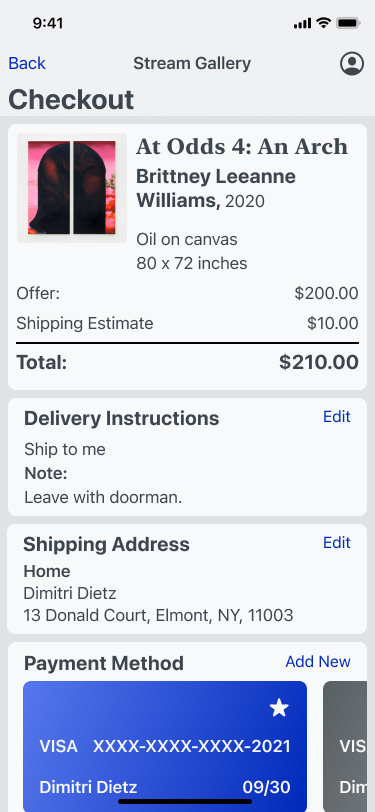
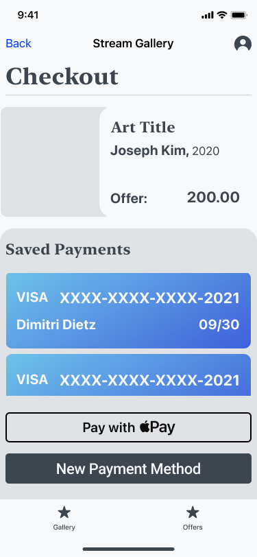
Checkout forms can be difficult to get just right. I decided the bill should be the first thing a user sees at the top of the form. Following are the delivery instructions, because if there was a pickup option available, then shipping details would be unnecessary. Afterwards the User adds their preferred payment option, and confirms checkout.
Most carts get abandoned at checkout, so while this may be suitable for this project, there is definitely still space to develop and refine the checkout process.
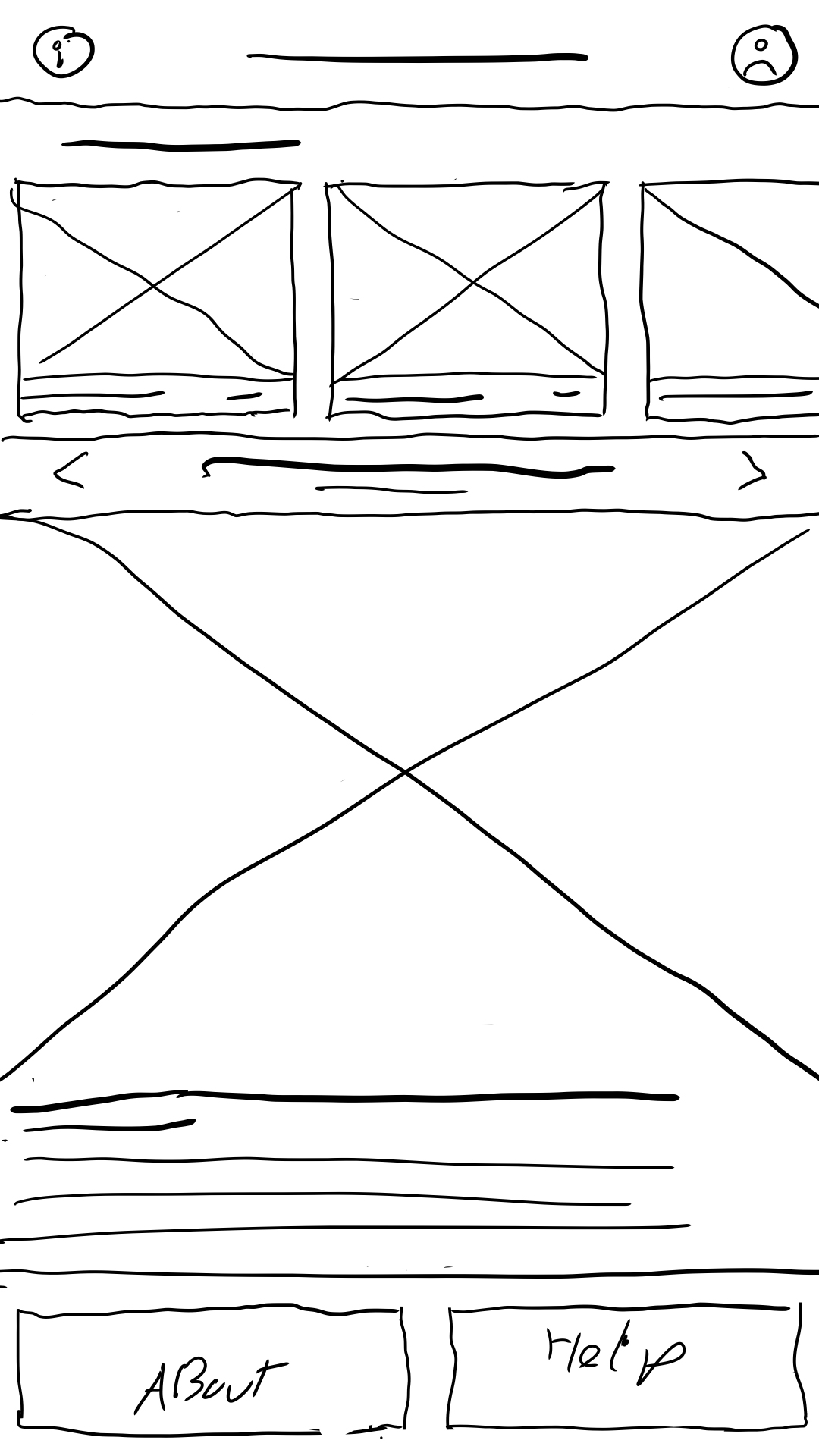
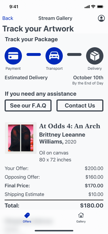
Immediately after checkout, Users arrive here. I was concerned this would be jarring for users, but my research gave me confidence in this decision. This move allows users to know where to find their pending offers.
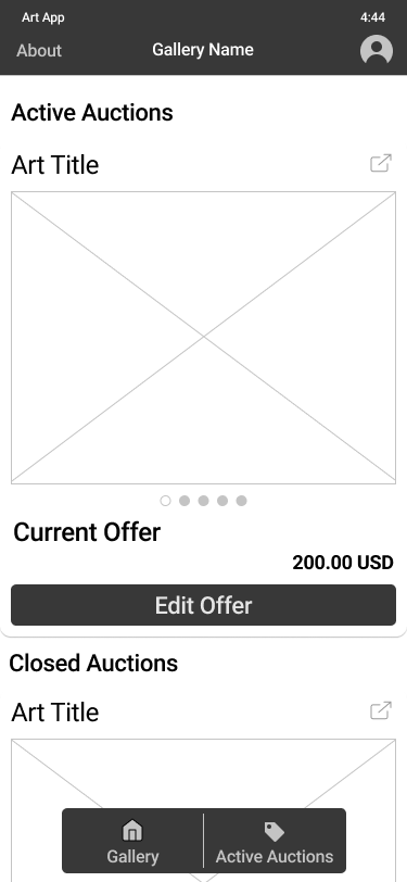
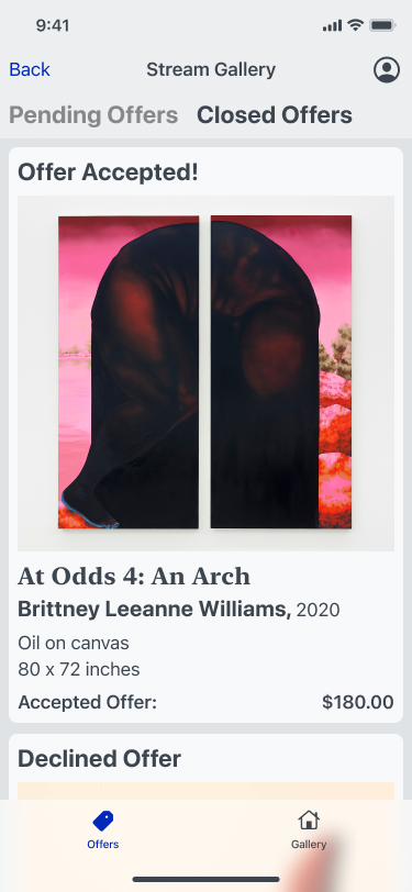
After the offer period closes, Users will receive a notification or email, with shipping info if their offer was accepted. This information will be available in the closed offers tab.
I’m proud of the work I’ve done, but if I were to continue developing this project, I’d love to work with a diverse team. I know that the best designs come from teams who can collaborate and execute designs for the widest range of users. Working as part of a team makes for better solutions, and it’s way more fun!
I’d love to test how this design would handle a variety of real world applications. As I mentioned earlier, galleries can have a wide range of shows that demand different needs. I’d like to stress test this application to see if it can still maintain a pleasant viewing experience for users who just wish to explore an exhibition.
One feature I was interested in was voice to text. This would provide one more accessibility feature for differently abled users, and could provide an opportunity for guided tours. This could be a nice way to enhance the in person experience a gallery offers.
I’ve always enjoyed designing in an iterative process, and I appreciate that design thinking encourages that. I think I found success in revisiting my research and pivoting the design in a new direction. It allowed me to find stronger solutions for the Users.
The interviews I conducted gave me strong direction and insights to apply to my designs.
One consistent theme throughout this case study is I had an assumption or idea that was immediately challenged when I started talking with users. It really puts into perspective how different the way people approach challenges.
Early on in the process, I thought I could help users by providing an overview of the auction process before they made their offer, so they could proceed with confidence. I quickly found out that users don’t have questions and immediately go looking for answers. Users will go through a task and try to figure things out as they go. This insight will probably inform a lot of my UX design in the future. It’s important to guide users as they complete a task, but keep the help button close.